I’ve been looking through some ‘Terrible Listings’ blogs, and I thought I’d impart what I’d learnt to help you Realtors out there stay permanently off those lists. This may all be exaggerated in the name of humor, but take heed realtors, it’s a competitive world out there, and not everyone can afford a professional photographer.
What not to do with your listings photos
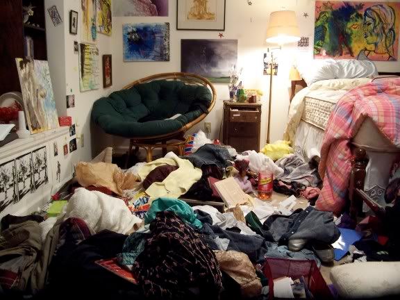
1. Clutter/Mess

Even if you were going in for the ‘lived-in homey’ look, this might be a bit more realistic than buyers can take. After all, they don’t want to be reminded of how their current place looks; that’s the whole point of them moving out in the first place!
In seriousness though, if you don’t want your photos to just show the bare frames of a house, it is nice to have some furniture and personal artifacts to spice up the look, but never go overboard! (Think Ikea. There must be a reason they sell so much furniture.)
2. People/Pets
As cute as this looks, I’m pretty sure the price on the listing is for the house, and not for the kids/pets (even if you were trying to get rid of them).
More realistically, just a general tip to check all mirrors and reflections carefully so that no one was accidentally caught on camera. You don’t want your photo to be one of those funny ones circulating the internet. Plus, although I am a pet lover myself, it might set alarm bells ringing in some buyers’ heads if they are worried about damage from rowdier pets.
3. Dirty
I would suggest in general and in life to clean up a bit after yourself.
4. Creepy
I realize I said make it look homey, but I’m not sure dolls are the way to go since “Chucky” aired. Other decor to look out for include ‘exotic’ elements such as animal rugs/heads or overly extravagant new-age style. Remember, simple is always safe and appeals to the widest audience!
5. Blurry/Dark Lighting
All I’m going to say for this is a little more effort please. Now is not the time for you to explore a new career in artistic photography.
Minor and basic details to meet are having the objects straight and centered, the photos correctly oriented, as well as clear and focused with sufficient lighting. Another headache avoider is if your images are different sizes or different pixels. Consistency helps convince buyers that it is the same house after all.
For a bit of more realistic help, check out this Ubertor blog post here with actual (professional) tips for picture taking.
Also, we tip our hats to these Ubertor sites that have managed to take it to the next level:
- Ianwatt.ca
- Manyeelui.com
- Sothebysrealtyoakville.ca
- Lancephillips.com
And so for you Realtors out there, what are your pet peeves for listing photos?
Leave your thoughts in the comments below!


